Building a responsive design system for a rapidly growing startup.


WISE Cities is a startup dedicated to creating accessible technical solutions for older adults. I worked as one of the founding designers to establish a design system that can improve design & development workflow, and communication between teams, collaborating directly with the co-founder and a team of developers.
KEY SKILLS
Design system foundations, components, and documentation
KEY IMPACT
Shipped design system in 6 months with 50+components
TIMELINE
Aug 2023 - Jan 2024
TEAM
A team of 2 Me and Kat Close (design head/co-founder)
PROBLEM
Existing design system was resulting in longer onboarding and handoff sessions.
DESIGN CHALLENGE
How do we re-build the design system to improve design & development workflow?
The goal was to re-build the design system for all the devices we were supporting at the moment, with the goal of consistency, and faster handoff. However, we had to identify what was causing these results to start improving.
WHAT IS CAUSING THE PROBLEM?
Inefficiencies and inconsistencies in the design system were the primary communication issues leading to delays and inconsistencies in design work.
Inconsistencies
The foundations were missing some of the styles used across app design, which resulted in designs being inconsistent.
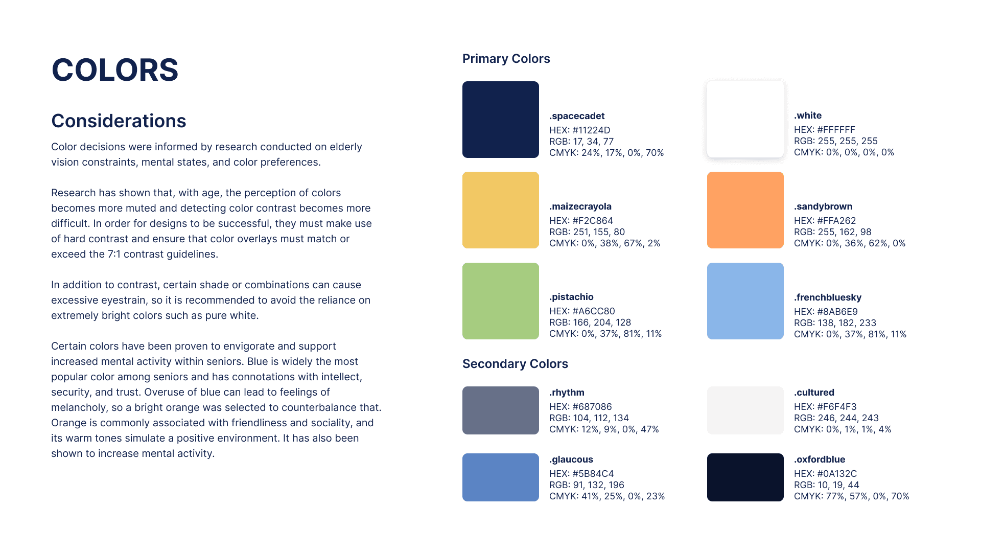
Colors had no specification of semantic use and accessibility.
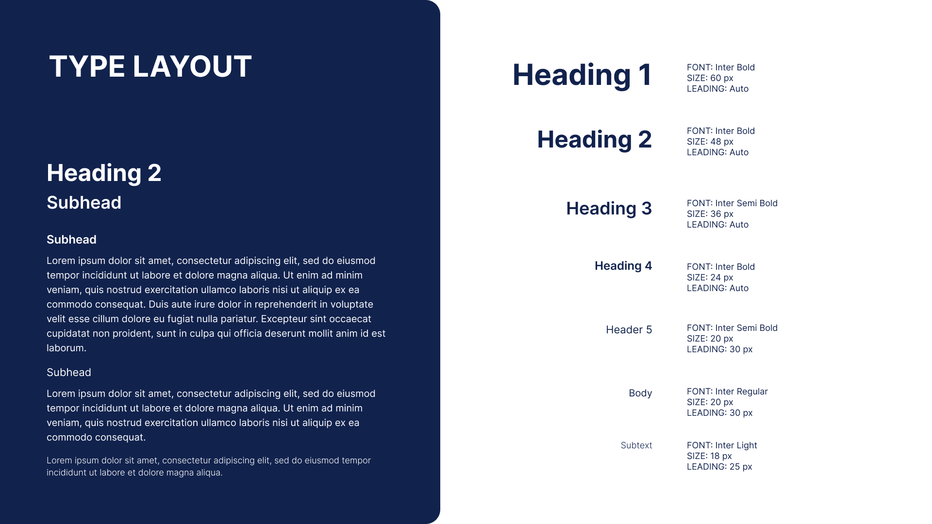
The type layout didn't have guidelines for responsive device usage.
Inefficiencies
The existing components were inconsistent in terms of foundations and were not optimized by using amazing Figma features like variant properties, instance swap properties, and layer toggles.
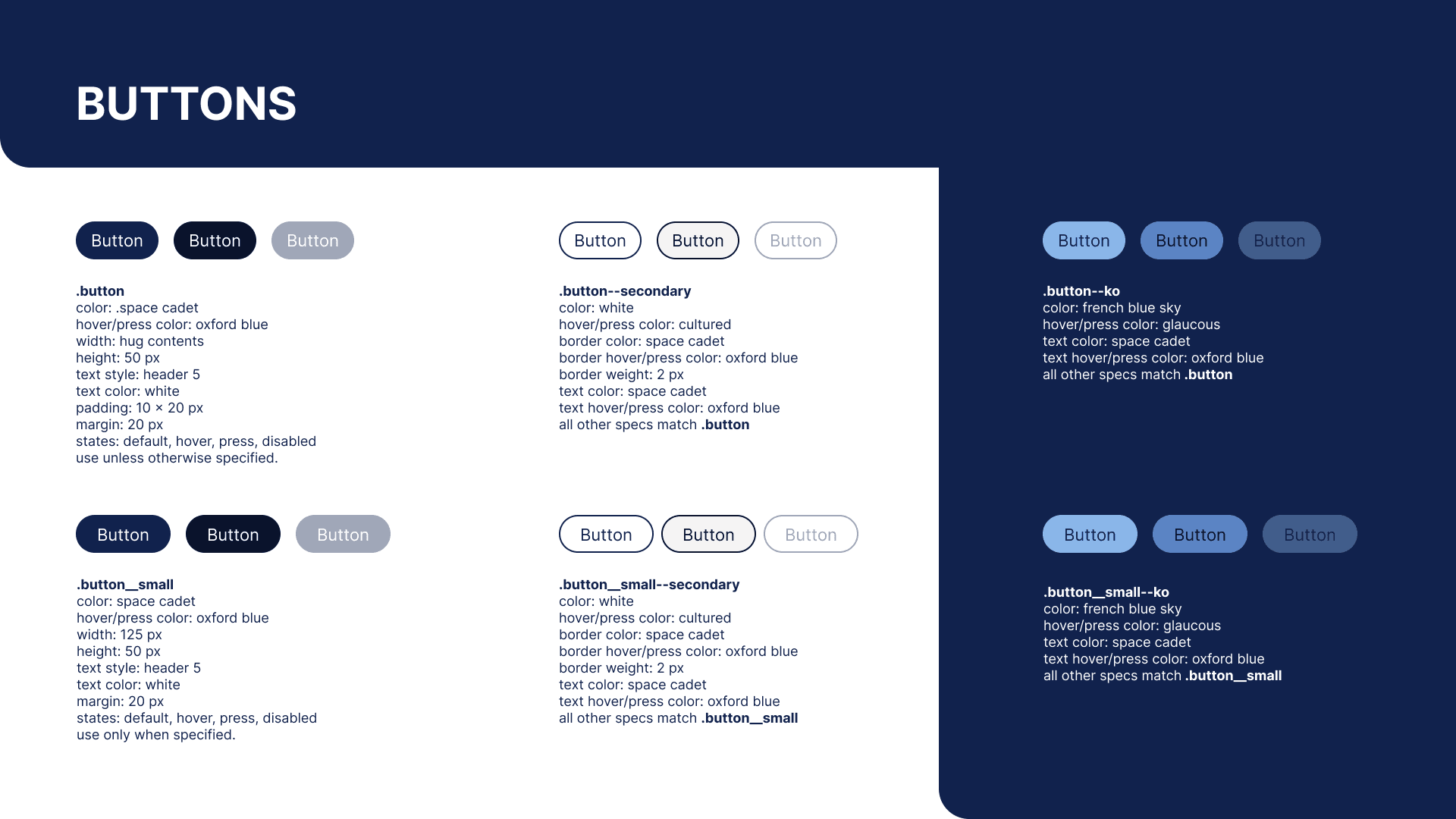
Buttons had no variants for including icons and were not given responsive device breakdown.
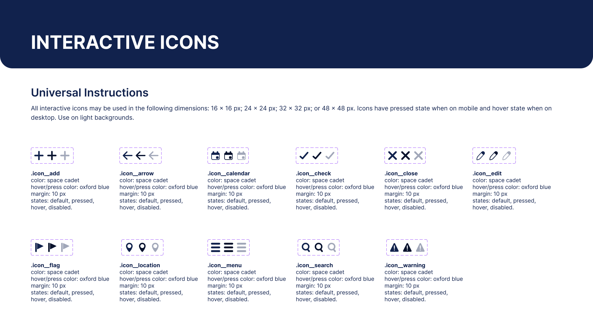
All icon buttons were made into separate components rather than having a placeholder for instance swap.
REQUIREMENTS
Design system had be built for beginners with student startup resources.
Student designers and developers being the main users
As a student-led startup at the University of Maryland, most team members can be considered beginners. therefore, we aimed to build a design system that is easily comprehensible for them.
Strategically targeting constraints
Given that this startup is in its early stages and relies primarily on student volunteers for product development, we encountered various constraints while establishing the design system.
Not having a premium version of Figma
Build and document whole design system on one Figma page.
Most of the current users of this design system are beginners
Document components in detail and necessary guidance
Necessity to ship it faster
Include only necessary details in the documentation
DESIGN SYSTEM CREATION
Collaborated with developers to align naming and component structure across Figma and Storybook.
We collaborated with developers, ensuring unified naming conventions and component organization that worked for both designers using Figma and developers using Storybook.
Colors system with semantic tokens
In our color palette, we categorized colors into primary and secondary groups based on their usage. We also created two types of tokens: semantic tokens and component tokens. This thoughtful categorization and token system enhanced the clarity and versatility of our color palette within the design system.
Considerations for developers: Documented token names and color codes in all format
Considerations for Designers: Tokens with functional names, established variables in Figma and a guide for use cases & accessibility


Responsive Typography with One Typescale
We organized our typography into functional categories, specifically display, heading, and body text. To simplify our approach, we adopted a single-type scale instead of managing three for different breakpoints, prioritizing ease of implementation.
Considerations for developers: Ease of implementation of responsiveness
Considerations for Designers: Functional names, guide for use cases & accessibility
Icons, Spacing and Grids
For components, we utilized icon placeholders to implement icon swap properties, to cater to various use cases seamlessly. all the icons were made available to swap through an icon library.
Our spacing scale incorporated the most frequently used spacings in our existing designs, coded as variables in figma to ensure consistent application across different design elements.
Additionally, our device grids were strategically aligned with screen sizes within the responsive spectrum, enhancing the adaptability and coherence of our design system


COMPONENTS
Component documentation included anatomy, variants, skeleton, notes and accessibility considerations.
Consistency across breakpoints was a top priority for us, ensuring that components remained uniform. Changes in spacing and text sizes were only made when necessary across different sizes.
During the component creation process, our focus was on accessibility, simplicity, and maintaining consistency, aligning with specific insights found from our research with elderly users.

FINAL RESULTS
Design system leveled up, for better.
Key outcomes
6 Months
We as a team of 2, managed to roll out the new design system in just 6 months, keeping pace with the fast-moving startup environment.
50+ Components
We managed to build 50+ components along with established foundations and Figma variables/design tokens.
Faster work
A standard design system made it easier to communicate among teams and made design work faster.
IMPACT
The improved design system benefitted both designers and developers, positively impacting our product and users.
Development
The improved design system streamlined the developers' workflow, allowing efficient communication with the design team during implementation discussions. As the foundational elements are established now, we could prioritize discussing features rather than delving into low-level UI details such as color values, spacing, small components, interactions, states, etc.
Design
Having a pre-built library of components streamlined the process of creating high-fidelity interfaces, reducing the time required for designing interfaces from days to just a couple of hours.
Product
The design system enabled rapid prototyping, facilitating the testing of more ideas, quick evaluation of hypotheses, and the creation of additional variations for A/B testing. These benefits could significantly contribute to the success of the product.
Users
The things improved within the company will eventually help make our users' experience better.
LEARNINGS
Value of collaboration to make the design system actually work
I learned that the most crucial thing while creating a design system is collaboration. Making sure to include both designers' and developers' perspectives, and finding a middle ground to make it easier for both parties is very important.
If the design system doesn't work for their users. then it can cause a lot of conflicts and delays in the design and implementations work.
Conventional design system practices may not necessarily align with the needs of your team.
I went through a lot of standard design systems to learn the best practices. However, some of those practices still did not work for our team, and I had to find a suitable way to customize the system for our specific needs.
